Although TAD had worked on their enterprise AV projects, this would be the first project where a collaboration was required between the Corporate Integration and Retail Design groups. Independently, the Retail Design group reached out to TAD through a personal connection formed during prior work experience. Citi Corporate had been using TAD as an AV design consultant for more than five years prior, which resulted in a deep strategic relationship. In contrast, Citi Retail had historically hired design/build firms who executed simple, closed-loop systems that were easily repeated and deployed. These were more simple designs utilizing 2×2 video walls facing exterior branch windows. Advertising content was displayed with the specific goal of attracting customers into the branch.
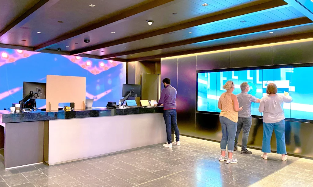
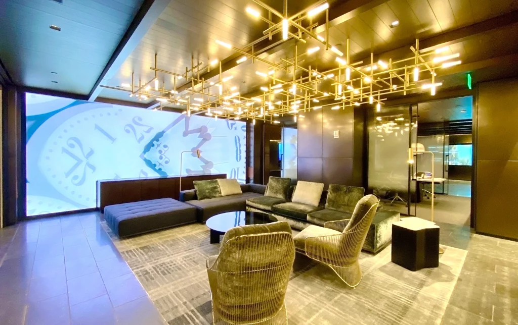
The new user experience was the core focus inside the branch but what better way to begin this experience then with an attractive and modern storefront? The new flagship has a spectacular answer with its four ATM pillars clad in high-resolution direct-view LED. Custom content reflects the unique qualities of the Tribeca neighborhood in which the branch resides on the ATM pillars and several other large canvases throughout the space. And if that wasn’t enough, the space can even be transformed for events should the need arise. This was an entirely new concept for the retail team but one which the corporate team had a great deal of experience. Any of the screens in the space can be taken over to host a presentation, TED-talk, cocktail hour, DJ, or other similar event with support from the background music system. Now that these designs are in place, TAD is working with both Citi teams to refine and modularize the designs into new standards that can be deployed across the wider retail portfolio.
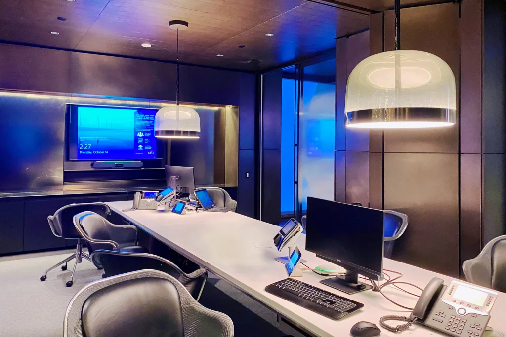
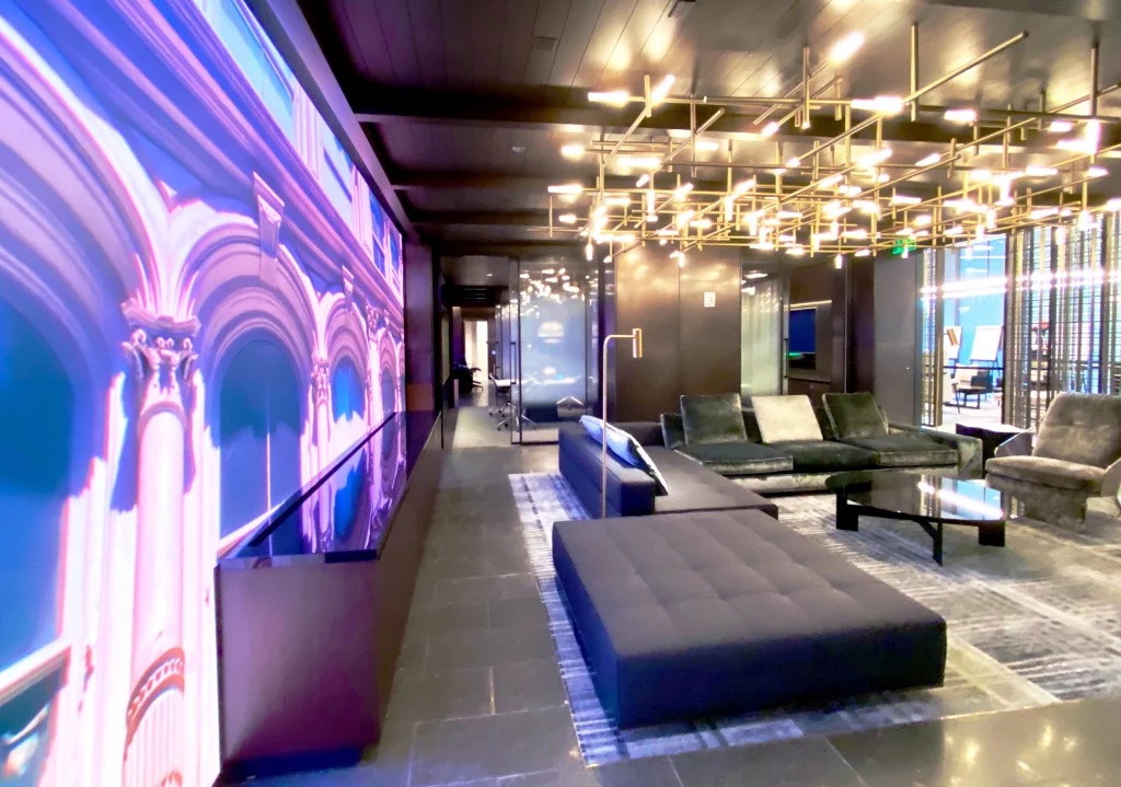
The new user experience was the core focus inside the branch but what better way to begin this experience then with an attractive and modern storefront? The new flagship has a spectacular answer with its four ATM pillars clad in high-resolution direct-view LED. Custom content reflects the unique qualities of the Tribeca neighborhood in which the branch resides on the ATM pillars and several other large canvases throughout the space. And if that wasn’t enough, the space can even be transformed for events should the need arise. This was an entirely new concept for the retail team but one which the corporate team had a great deal of experience. Any of the screens in the space can be taken over to host a presentation, TED-talk, cocktail hour, DJ, or other similar event with support from the background music system. Now that these designs are in place, TAD is working with both Citi teams to refine and modularize the designs into new standards that can be deployed across the wider retail portfolio.
